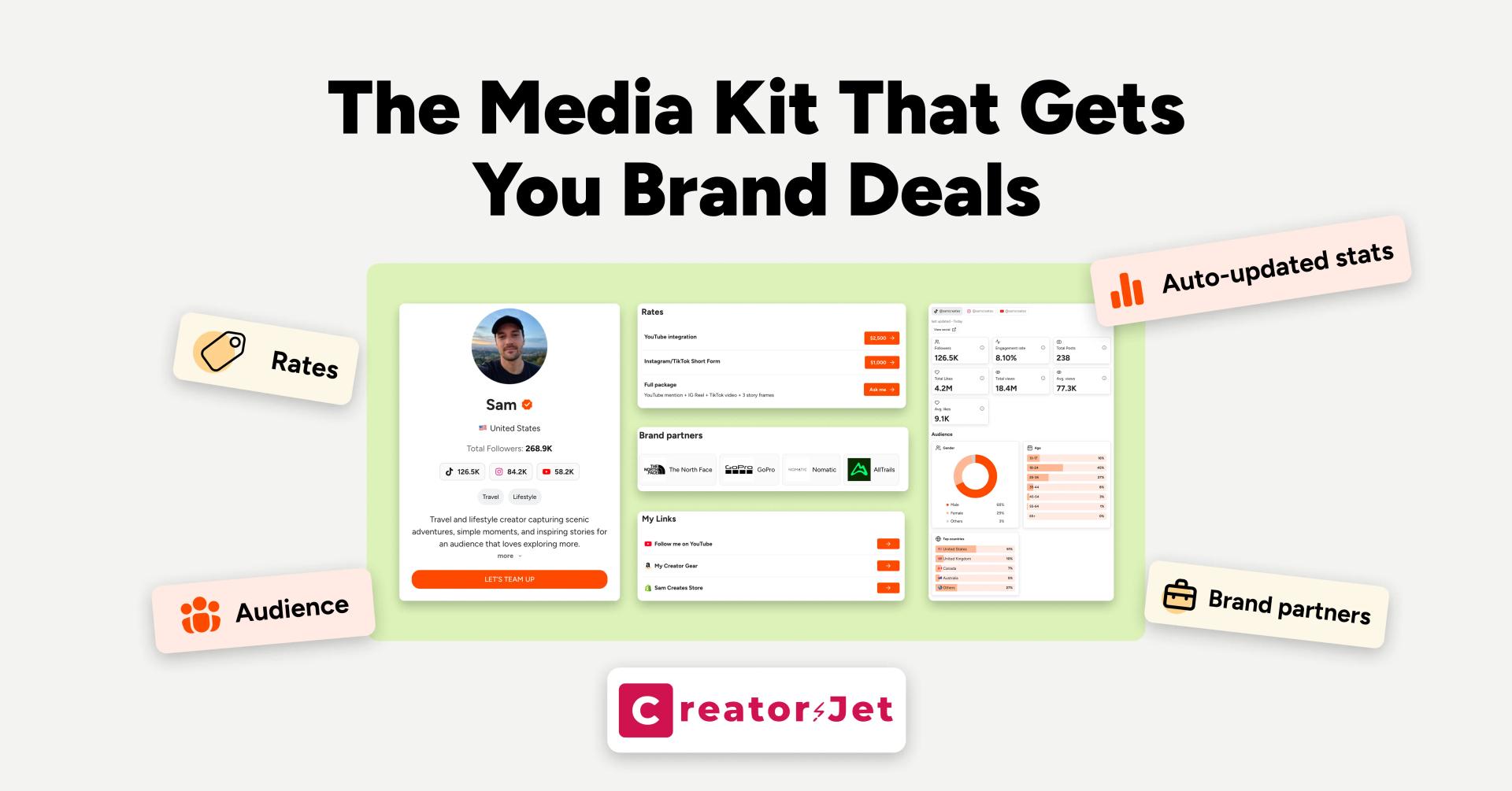
A media kit can be good enough to send and still make a brand hesitate. The problem is not always design. Most media kit mistakes happen when the brand cannot quickly understand the creator's value, trust the numbers, or see how a collaboration would work.
This article is not another list of everything a media kit should include. It is about the mistakes that make a brand lose confidence, skip key information, or pass on the creator even when the audience and content are good.
The mistake is not having a media kit. It is making the brand work too hard
Brands usually review creators fast. A marketer might compare 20 creators for one campaign, check audience fit, look for proof, scan content examples, and forward a shortlist to a team.
If the media kit makes that job harder, the creator becomes easier to ignore.
The goal is simple: a brand should understand three things in less than a minute:
- Who the creator reaches.
- Why that audience fits the brand.
- What collaboration would make sense.
Anything that hides those answers creates friction.
Mistake 1: leading with follower count instead of fit
Follower count gives scale, but it does not prove relevance. A media kit that opens with "75K followers" and nothing else forces the brand to guess whether those followers match the campaign.
Brands care about fit because influencer selection is not only about reach. Sprout Social's influencer marketing research notes that consumers look for alignment, authenticity, and relevance in influencer content, which is exactly why brands evaluate more than audience size. A creator with a smaller but clearer audience can look more useful than a larger creator with vague positioning.
Better media kit framing:
- "Skincare creator for busy women building simple evening routines."
- "Budget travel creator focused on weekend city breaks from London."
- "Fitness creator reaching beginner lifters who want practical gym confidence."
The fix is not to hide follower count. Keep it visible, but place it next to niche, audience profile, location, content angle, and the type of buyer or community the creator reaches.
Mistake 2: using old or unverifiable stats
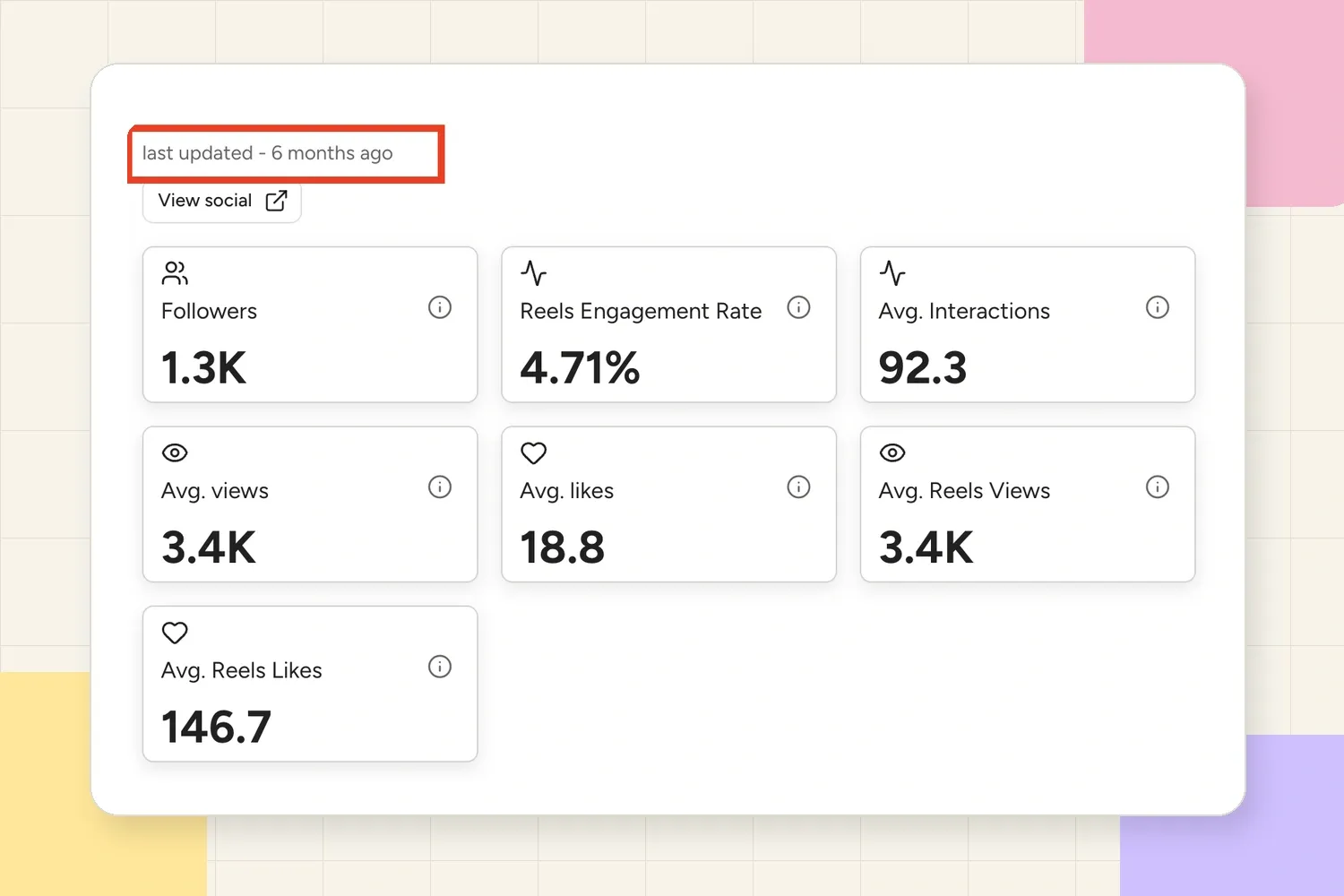
Old stats make a media kit feel unreliable. If the kit says "last updated: 2024" or shows screenshots from a campaign that no longer reflects the creator's current audience, the brand has to wonder what else is outdated.
This is one of the easiest trust problems to fix.
Update:
- Follower count by platform.
- Average reach or views.
- Engagement rate or average interactions.
- Audience demographics.
- Recent sponsored examples.
- Contact information and social handles.
If a stat changes often, label the date clearly. "Instagram audience, July 2026" feels more trustworthy than a number with no context.
Even good-looking stats can lose credibility if the update date tells the brand the numbers may be stale.
Mistake 3: showing metrics without explaining what they mean
A media kit can have plenty of numbers and still not help the brand decide.
For example, "2.4% engagement rate" is useful, but it becomes more persuasive when paired with context:
- Is that good for the creator's niche?
- Which content formats drive the engagement?
- Are comments real questions, compliments, product interest, or giveaways?
- Are saves, replies, clicks, or shares included anywhere?
A brand does not just need metrics. It needs interpretation.
Weak:
Engagement rate: 2.4%
Better:
Average Instagram engagement rate: 2.4%. Best-performing formats are product routine Reels, comparison posts, and saved checklists.
That second version tells the brand how the creator's audience behaves. It makes the number easier to use in a campaign decision.
Mistake 4: making the audience section too generic
"Mostly women aged 18-34" is not enough if every creator in the category can say the same thing.
A useful audience section should make the brand feel like the creator understands who is paying attention and why that group matters.
Add detail such as:
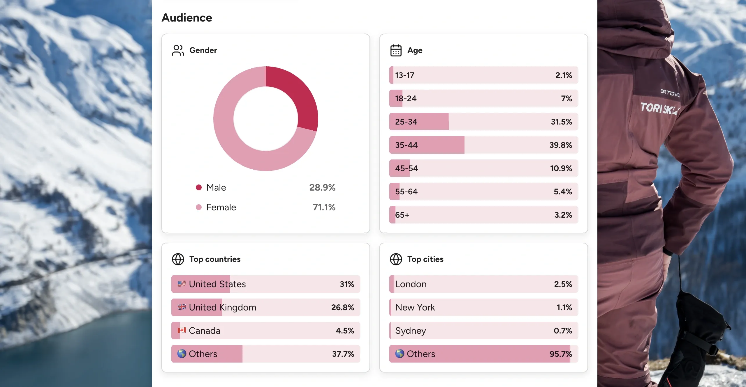
- Top countries or cities.
- Age range.
- Gender split when relevant.
- Main interests.
- Buying context.
- Common audience questions.
- Content topics that get meaningful engagement.
This is where many creators accidentally overlap with everyone else. The fix is specificity. A skincare audience is not just "women 18-34." It might be "women in the US and Canada looking for fragrance-free products, simple routines, and affordable product swaps."
That gives a brand something to evaluate.
An audience section becomes more useful when it helps the brand check demographic and location fit without asking for extra screenshots.
Mistake 5: adding too many pages without a clear hierarchy
A long media kit is not automatically more professional. If the brand has to scroll through a full biography, old press logos, every platform, every package, every testimonial, and every rate before reaching the useful proof, the kit becomes tiring.
The problem is not length by itself. The problem is weak hierarchy.
Put the most decision-critical information first:
- Creator snapshot.
- Audience fit.
- Content examples.
- Performance proof.
- Collaboration options.
- Contact details.
Extra context can come later. A brand should not need to read everything to understand whether the creator belongs on the shortlist.
Mistake 6: using content examples that do not match the offer
If the creator wants sponsored Reels, the media kit should show Reels. If the creator wants UGC work, it should show content that looks useful to a brand even without posting from the creator's account. If the creator wants event coverage, it should show live coverage, Stories, or recap content.
Many media kits include pretty content examples but not relevant ones.
Ask:
- Does this example match the collaboration being pitched?
- Does it show the creator's style clearly?
- Does it show product use, storytelling, education, or audience response?
- Would a brand understand how this could work for its own campaign?
A beautiful lifestyle photo can support the brand image. But if the brand needs paid social assets, a high-performing Reel or UGC-style video may be more useful proof.
Mistake 7: hiding proof behind vague claims
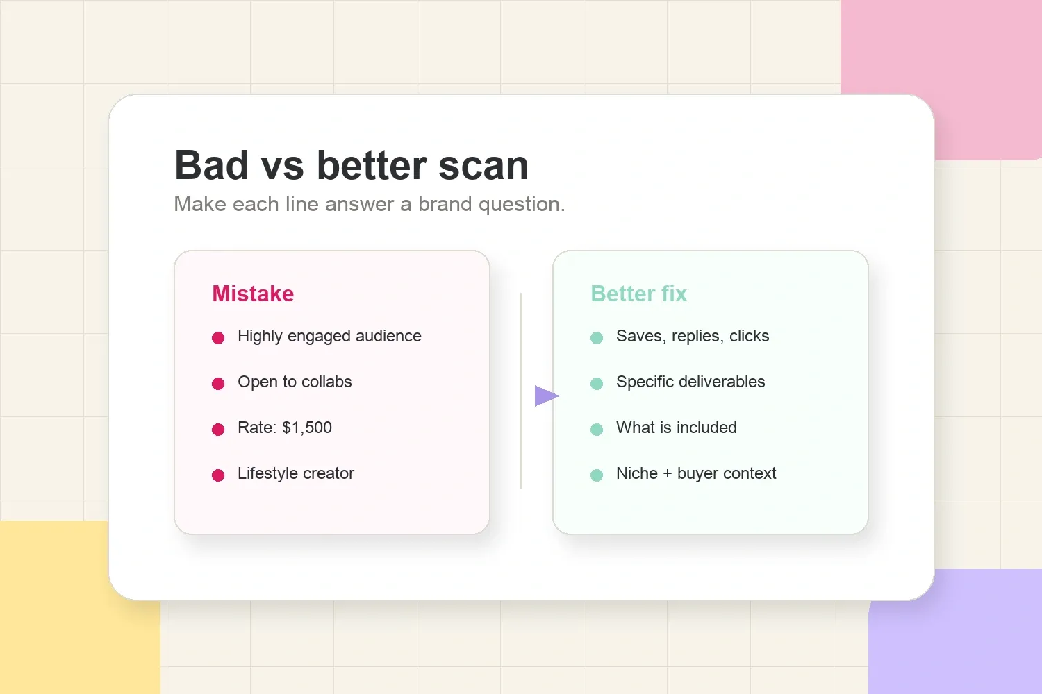
Brands ignore media kits that say "highly engaged audience" but do not show evidence.
Proof does not need to be complicated. It can be:
- A screenshot of Instagram or TikTok analytics.
- A campaign result summary.
- A sponsored post with saves, comments, link clicks, replies, or reach.
- A short testimonial from a brand.
- A before-and-after example of content performance.
- A clear note about a repeat collaboration.
The key is to connect the proof to the promise. If the media kit says the creator drives product discovery, show comments, clicks, saves, or audience questions. If it says the creator makes high-quality content, show examples that prove production, editing, and storytelling.
Mistake 8: unclear collaboration options
A brand should not leave the media kit wondering what the creator actually sells.
Common problem:
Open to collaborations, sponsored content, UGC, events, and more.
That is too broad to act on.
Better:
- Sponsored Instagram Reel + 3 Story frames.
- TikTok product review video.
- UGC video package for brand ads.
- Event coverage with same-day Stories and recap Reel.
- Usage rights or paid amplification as add-ons.
This does not mean every media kit needs a full rate card. But it should explain the available collaboration formats clearly enough that the brand can imagine a deal.
Mistake 9: mixing rates, usage rights, and deliverables together
Rates are useful when they reduce back-and-forth. They become a problem when the brand cannot tell what is included.
For example:
Reel package: $1,500
That raises questions:
- Is usage included?
- Are Stories included?
- How many revisions?
- Is whitelisting included?
- Can the brand use the video in ads?
- Does the price include exclusivity?
A cleaner version:
Sponsored Reel: includes concept, filming, editing, caption, posting, and 30 days of organic visibility. Usage rights, paid amplification, exclusivity, and extra revisions are priced separately.
This protects the creator and makes the brand feel the creator understands commercial scope.
Mistake 10: making the design look busy instead of useful
Design matters, but not because the media kit needs to look expensive. It matters because layout controls how fast the brand can scan the information.
Avoid:
- Tiny text.
- Too many colors.
- Dense paragraphs.
- Low-contrast screenshots.
- Decorative sections that push useful information down.
- Screenshots that are too small to read.
- Pages that look good but do not answer brand questions.
The practical rule: design should make proof easier to understand. If a visual element does not help the brand read, compare, or trust the information, it is probably decoration.
Mistake 11: not showing brand safety or content boundaries
Brands think about risk. CreatorIQ's creator marketing safety report describes brand safety as a mix of risk mitigation, suitability, and fit. That matters because a brand is not only asking, "Can this creator reach people?" It is also asking, "Is this creator a good fit for our reputation?"
A media kit does not need to become a compliance document. But it should make the creator look reliable.
Useful signals:
- Clear niche and content categories.
- Types of brands the creator works with.
- Categories the creator avoids when relevant.
- Disclosure comfort for sponsored content.
- Examples of past brand-friendly content.
- Clean contact details and professional links.
If a creator has strong opinions, humor, or edgy content, that does not automatically make them unsafe. But the media kit should help the right brands understand the creator's style instead of making them guess.
Mistake 12: using broken links or hard-to-open files
This mistake sounds small, but it kills momentum.
Brands may skip a creator if:
- The media kit link asks for access.
- The PDF is too heavy to open quickly.
- Social links are broken.
- A portfolio link leads to old content.
- Contact details are missing or outdated.
- The file name looks messy.
Use a clean file name, such as creator-name-media-kit.pdf, or a clean live link. Test it on mobile and desktop before sending. If the brand cannot open the kit quickly, the content inside does not get a chance to work.
Mistake 13: writing everything from the creator's point of view
A media kit should show personality, but it should not read like a personal scrapbook. Brands are looking for business fit.
Creator-focused:
I love making fun content and working with brands that align with me.
Brand-ready:
I create short-form product storytelling for skincare and wellness brands that want practical, saveable content for millennial buyers.
The second version still has personality, but it gives the brand a reason to care. It connects content style, category, and audience.
Mistake 14: not matching the media kit to the pitch
The media kit and pitch should tell the same story.
If the pitch says the creator is perfect for a travel brand because the audience is planning summer trips, the media kit should show travel audience data, travel content examples, and proof from travel or lifestyle posts. If the kit is generic, the pitch has to do all the work.
This is where the pre-pitch media kit checklist is useful. Before sending the kit, check whether the proof, examples, and collaboration options support the exact brand being contacted.
Quick diagnosis: why a brand might ignore the kit
Use this table when a media kit looks fine but replies are slow.
| Brand reaction | Likely media kit issue | Better fix |
|---|---|---|
| "Not sure they're a fit." | Audience and niche are too vague. | Add audience profile, location, interests, and buyer context. |
| "Need more proof." | Claims are not backed by results. | Add screenshots, campaign results, content examples, or testimonials. |
| "What do they offer?" | Collaboration options are unclear. | List specific formats and what each includes. |
| "This feels outdated." | Stats, examples, or links are old. | Add a visible update date and refresh key metrics. |
| "Too much to read." | The kit has weak hierarchy. | Move the brand decision points near the top. |
The table is not a replacement for the full media kit. It is a fast way to spot the reason a brand may be hesitating.
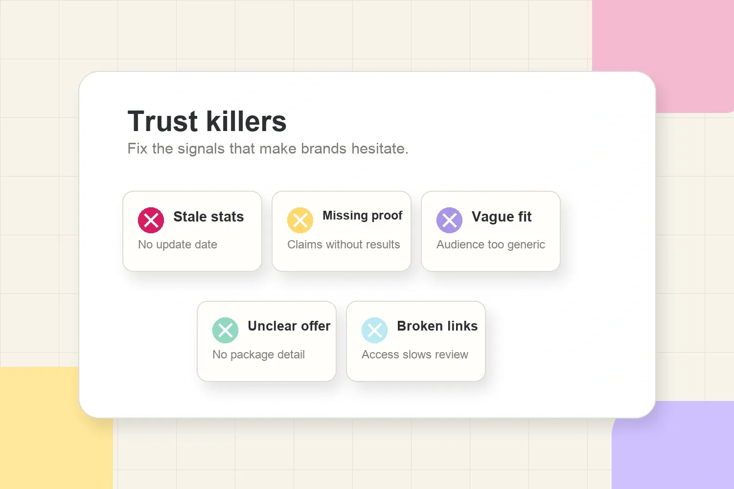
The same issues usually show up as a few visible trust signals: stale numbers, missing proof, vague fit, unclear offers, or links that slow the review down.
What to remove from a media kit
Sometimes improving a media kit means deleting, not adding.
Consider removing:
- Old screenshots that no longer reflect current performance.
- Personal details that do not help a brand decision.
- Vanity press mentions with no relevance to the pitch.
- Weak testimonials that sound generic.
- Platforms where the creator is inactive.
- Rates that are outdated or unclear.
- Long paragraphs that repeat what the pitch already says.
- Content examples that do not match the collaboration being sold.
A lean media kit with clear proof usually works better than a large kit full of weak signals.
How to fix the kit without rebuilding everything
Creators do not need to redesign the whole media kit every time replies slow down. Start with the parts that change brand trust fastest.
Fix in this order:
- Update the stats and screenshots.
- Rewrite the creator positioning in one clear sentence.
- Add audience context beyond follower count.
- Replace weak examples with relevant content proof.
- Clarify collaboration options.
- Check links, file access, and contact details.
- Remove anything that distracts from the decision.
If the structure itself is the problem, using a dedicated media kit builder can be faster than trying to repair a messy PDF page by page.
If the audience section is the weak point, the guide on how to know if your Instagram audience is valuable to brands can help sharpen the proof before it goes into the media kit.
Final take
Media kit mistakes usually come down to trust and clarity. If a brand cannot understand who the creator reaches, why the audience fits, what proof exists, and what collaboration is available, the safest move is often to move on.
A better media kit does not need to be longer. It needs to make the brand's decision easier: clear positioning, current stats, relevant proof, specific options, clean links, and no confusion about what is included.