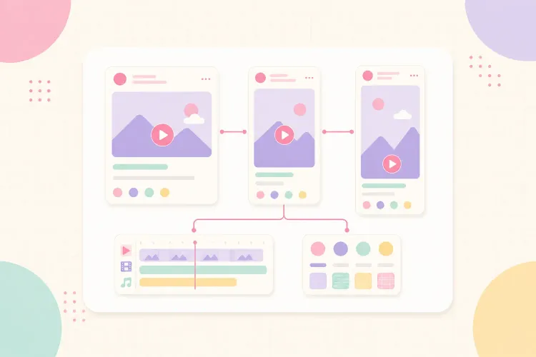


When a viewer recognizes a video before checking the username, the creator has a recognizable style. That recognition does not come from using the same transition in every post. It comes from repeating a small set of decisions: what the creator notices, how the idea is framed, how the video looks, how the edit moves, and what kind of payoff the audience expects.
The practical goal is not to make identical videos for Reels, TikTok, and Shorts. The method is to audit or test the choices that feel natural, document a small creative fingerprint, build two or three repeatable formats, and then adapt the opening, pacing, packaging, and platform-native details around that core.
A recognizable video style is a system, not a preset
A preset can make several videos look similar. A system makes them feel as if they came from the same mind.
That distinction matters because trends, formats, and platform features change. If a creator's identity depends on one font, one filter, or one trending sound, it disappears as soon as that device stops working. A more durable style combines several layers:
- Point of view: the questions, observations, and opinions the creator returns to.
- Delivery: the energy, sentence rhythm, humor, directness, or teaching style.
- Visual language: framing, color, lighting, typography, captions, and recurring props or locations.
- Editing rhythm: shot length, pauses, zooms, cutaways, sound cues, and how quickly context appears.
- Repeatable formats: recognizable series, recurring structures, and familiar endings.
No single layer has to be unique. Recognition comes from the combination. Plenty of creators use bold captions, direct-to-camera footage, and jump cuts. Far fewer use the same combination of topic choice, phrasing, color, pace, and recurring series logic.
Start with an audit of the videos that already feel like you
Building a style from a blank mood board often produces something polished but artificial. A better starting point is the work that already feels natural.
Review 10 to 20 recent videos and mark the moments that feel most representative. Include posts that performed well, but do not limit the audit to winners. A lower-view video can still contain the most recognizable delivery, framing, or idea.
Look for repeated signals:
- Which topics create the clearest opinions or explanations?
- Does the creator sound best when teaching, reacting, documenting, reviewing, or telling a story?
- Which camera distance and setting feel natural?
- What caption treatment is readable without taking over the frame?
- Where does the pace feel confident rather than rushed?
- Which lines, shots, or structures could become a recurring series?
Then create two lists: keep and remove. Keep the choices that feel distinctive and sustainable. Remove the habits that were copied from a trend, take too long to produce, or make every post look like everyone else's.
This audit should produce a short creative brief, not a brand manual. If it takes ten pages to explain the style, it will be hard to use while filming.
If you are starting from zero, run a six-video style sprint
An archive audit is useful when a creator already has 10 to 20 videos. A new creator needs a controlled experiment instead. The aim is not to discover a perfect aesthetic in one weekend. It is to collect enough evidence to see which choices feel natural, communicate clearly, and remain realistic to produce.
Use a six-video sprint over two or three weeks:
- Choose one narrow topic promise. Keeping the subject area stable makes it easier to judge the presentation rather than the idea itself.
- Pick two base formats. For example, make three direct-to-camera explanations and three voiceover demonstrations. These are test containers, not permanent identities.
- Keep the production setup simple. Use the same camera position, lighting option, and editing tool so equipment changes do not distort the comparison.
- Change one creative variable at a time. Test the opening structure, caption density, average shot length, use of B-roll, or music approach. If everything changes at once, the result will not show which choice helped.
- Record the production signal as well as the performance signal. Note whether the delivery felt natural, how long the edit took, where viewers dropped off, and what people mentioned in comments.
- Keep the repeatable combination. The useful style is usually not the flashiest test. It is the combination that communicates the idea well and can still be produced on an ordinary week.
References can help during the sprint, but study them at the level of principles. Write down “calm delivery,” “one visual proof before the explanation,” or “keywords highlighted in one color” rather than copying another creator's font, catchphrase, or exact cut pattern. A recognizable style comes from recombining useful influences around the creator's own point of view.
Define five creative constraints
Constraints make style repeatable. They reduce the number of decisions required for every edit without making the content rigid.
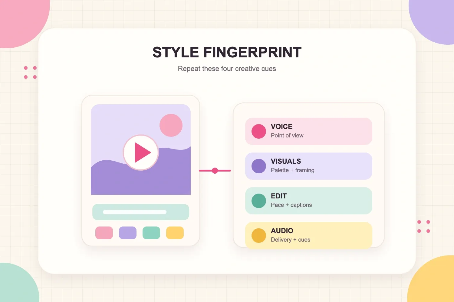
A useful short-form style guide can fit into five lines:
- Voice: one sentence describing how the creator communicates. Example: “Calm, specific explanations that challenge common fitness shortcuts.”
- Visuals: two or three recurring decisions. Example: natural window light, medium close-up framing, cream captions with one green highlight.
- Edit: one pacing rule and one transition rule. Example: remove dead space, but keep short pauses after important claims; use hard cuts instead of decorative transitions.
- Audio: one approach to speech, music, and sound cues. Example: clean voice first, low music, one subtle sound cue at the payoff.
- Format: two repeatable series structures. Example: “What this advice misses” and “Three ways to fix it.”
The constraints should be specific enough to guide an editor, but flexible enough to survive different topics. “Use magenta captions for the key phrase” is useful. “Every video must begin with the same five-word sentence” will become predictable quickly.
Turn the choices into a one-page video style guide
Once the sprint or archive audit reveals a pattern, turn the five constraints into a document that can be checked during filming and editing. A one-page guide is enough for a solo creator and is easier to maintain than a long brand document.
Keep the voice, visual, edit, audio, and format rules from the five-line brief. Add only the operational detail needed to apply them:
- Audience promise: what viewers reliably learn, feel, or see.
- On-brand and off-brand examples: concrete lines, frames, or editing choices that remove ambiguity.
- Format cards: two or three named structures with a hook, body, payoff, and representative example.
- Platform exceptions: the specific elements allowed to change on Reels, TikTok, and Shorts.
- Pre-publish check: five questions that decide whether the video fits the system.
For a calm fitness educator, “specific, reassuring, evidence-led” is more useful when paired with examples. An on-brand opening might be: “This cue makes the movement easier to control.” An off-brand version might be: “You have been doing this exercise completely wrong.” The examples show an editor what the tone means in practice.
The pre-publish check can stay equally short:
- Does the opening make the topic clear without relying on the username?
- Do the captions, framing, and audio match the usual hierarchy?
- Is at least one familiar format or creative cue present?
- Has the platform wrapper changed without changing the creator's identity?
- Could this production process be repeated next week?
Treat the guide as a working document. Change a rule when several posts show that it confuses viewers, slows production, or no longer fits the creator's point of view. Do not rewrite the system after one weak post.
Make the first three seconds recognizable
Short-form style is often judged before the full visual system has time to appear. The opening needs to carry identity quickly.
That does not mean forcing a logo animation or catchphrase into every post. It means making the first beat consistent in function. A creator might regularly:
- open on the result before explaining the process;
- state the uncomfortable truth before giving context;
- begin with a close-up demonstration;
- respond to a specific audience question; or
- place one recurring visual object in the opening frame.
The viewer starts to recognize the type of promise, even when the exact words and topic change. That is more useful than repeating a generic hook formula.
A fashion creator, for example, might always open with the complete outfit, then explain one decision that makes it work. A finance educator might open with the consequence of a common mistake, then show the calculation. The structure repeats; the substance stays fresh.
Keep the core and adapt the wrapper for each platform
Cross-posting the same export everywhere can save time, but a recognizable style should not become a refusal to adapt. Reels, TikTok, and Shorts place the video in different viewing contexts, with different discovery surfaces and audience expectations.
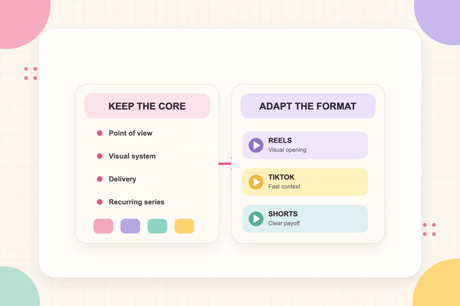
The portable core is the creator's point of view, visual cues, delivery, and recurring series. The wrapper includes the opening speed, caption density, cover frame, description, audio choice, and ending.
Reels: refine the visual entry point
On Reels, the first frame and cover can work together as packaging. Keep the creator's usual palette and caption hierarchy, but make the topic understandable when someone sees it in a feed or on the profile grid.
Meta's Reels creative guidance recommends 9:16 vertical video with audio and key creative elements inside the safe zone. The guidance is written for ads, but the same production principle helps organic creators keep faces, captions, and important visuals clear of interface overlays.
Useful adaptations for Reels:
- choose a clear cover frame that still matches the series;
- leave space around captions and faces for interface overlays;
- make the visual premise legible without relying on the caption below the post; and
- keep shareable or saveable takeaways easy to spot.
TikTok: enter the idea faster
TikTok often rewards context that feels immediate. The recognizable identity can remain polished, but the opening may need to feel less introduced and more like the viewer has entered a live thought, demonstration, or conversation.
Useful adaptations for TikTok:
- move the most specific line earlier;
- use on-screen context that sounds native to the topic rather than like a formal title;
- leave room for the interface on the right and bottom edges;
- use comments and audience language as inputs for follow-up videos; and
- let some edits feel looser when the idea benefits from immediacy.
Native does not mean careless. Audio still needs to be clear, captions need to be readable, and the first visual needs to tell the viewer where to look.
Shorts: make the promise and payoff clear
YouTube Shorts can reach viewers in the Shorts feed, search results, the homepage, subscriptions, and channel surfaces. That wider context makes a clear topic promise and satisfying finish especially useful.
According to YouTube's official Shorts upload requirements, a Short uploaded from a computer can be square or vertical and up to three minutes long. Treat that length as an option, not a target. A recognizable style should decide how much time the idea needs rather than stretching every video to the limit.
Useful adaptations for Shorts:
- state the subject in language that still makes sense outside a trend;
- deliver a clear payoff rather than fading out after the main point;
- connect related Shorts through a recurring series; and
- use the title to clarify the promise without repeating every word on screen.
Build a master edit, then create platform versions
A recognizable cross-platform style is easier to maintain when production begins with a clean master, not with a downloaded post from another platform.
Create a 9:16 master timeline with the core footage, clean voice audio, reusable caption styling, and safe margins. Keep platform-specific music, stickers, prompts, and end cards on separate versions. This avoids watermarks, protects edit quality, and makes small changes faster.
A practical file structure might include:
MASTERfor the clean edit;REELSfor the cover, caption spacing, and Instagram-specific audio;TIKTOKfor the faster opening or comment-led context; andSHORTSfor the title-led promise and adjusted ending.
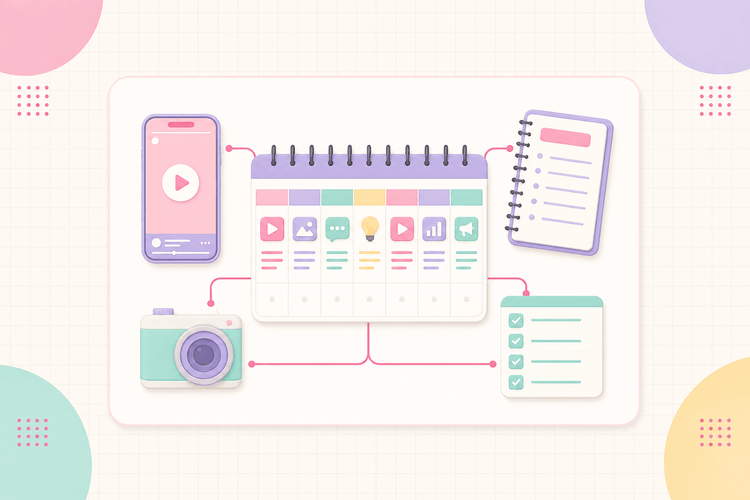
To turn this versioning process into a repeatable production schedule, the weekly content workflow for solo creators explains how to batch shared work, repurpose selectively, and leave room for platform-specific changes.
Test recognition without making every video identical
Consistency works when the audience can recognize the creator and still feel curious about the next post. The safest rule is to repeat the container while varying the contents.
Keep roughly three to five recognizable signals stable in a series, such as:
- the opening function;
- camera framing;
- caption hierarchy;
- delivery rhythm; and
- the way the payoff is summarized.
Then vary the topic, example, location, visual proof, or story. A repeated series title can help, but it should not carry all the recognition by itself.
If every video begins with the same wording, uses the same shot, and reaches the same conclusion, the style has become a template. If every video looks unrelated, the system is too loose. The useful middle ground is consistent identity with changing evidence.
Measure whether the style is becoming memorable
Views alone cannot show whether a creator is becoming recognizable. Use a mix of performance and audience signals.
Look for:
- comments that reference a recurring series or phrase;
- viewers who correctly anticipate the format or next step;
- profile visits and follows from videos in the same series;
- returning viewers on YouTube;
- shares and saves on recognizable educational formats; and
- several posts succeeding with the same system, not one isolated hit.
Review performance by format, not only by platform. Compare five videos from the same series and ask which opening, length, or proof type improved the result. This separates the identity from the execution.
Creators who pitch brands should save examples of recognizable formats as portfolio proof, ideally showing the same identity across different topics or platforms. This comparison of media kit tools for creators explains which options are better suited to keeping those examples, audience data, and partnership information current.
Common mistakes that make a style forgettable
Copying surface details from another creator
Borrowing a caption font or transition is easy. Borrowing someone else's delivery, opinions, and recurring jokes makes the result feel derivative. Study why a format works, then rebuild it around the creator's own subject and behavior.
Changing everything after one low-performing post
One video is not enough evidence to abandon a visual system or series. Test the format across several topics before deciding whether the identity is wrong or the individual idea was weak.
Making the edit more visible than the idea
Transitions, zooms, and sound effects should guide attention. When viewers notice the editing before they understand the point, the style becomes decoration.
Using identical packaging on every platform
Recognition does not require the same hook, caption density, music, and ending everywhere. Keep the identity stable and let the wrapper respond to the viewing context.
Designing a style that is too expensive to repeat
A five-hour edit can be appropriate for a flagship series. It is a poor default for a creator who needs to publish three times a week alone. The best style is one that still looks intentional on a normal production day.
A simple 30-day rollout
Use one month to turn the style from an idea into evidence:
- Week 1: Diagnose. Audit 10 to 20 existing videos. If there is not enough work to review, plan the six-video sprint and publish the first tests.
- Week 2: Define. Finish the sprint if needed, choose the repeatable voice, visual, edit, audio, and format signals, then create the one-page guide and master project.
- Week 3: Publish. Release three to five videos using the system. Adapt the wrapper for each platform instead of changing the identity.
- Week 4: Review. Compare retention, comments, shares, follows, profile visits, and returning viewers. Keep the signals that improve recognition and remove anything that adds work without helping the audience.
At the end of the month, the style guide should be shorter and clearer than it was at the beginning. A recognizable video style is not a finished aesthetic. It is a repeatable set of creative decisions that becomes more precise as the creator publishes, reviews, and adapts.