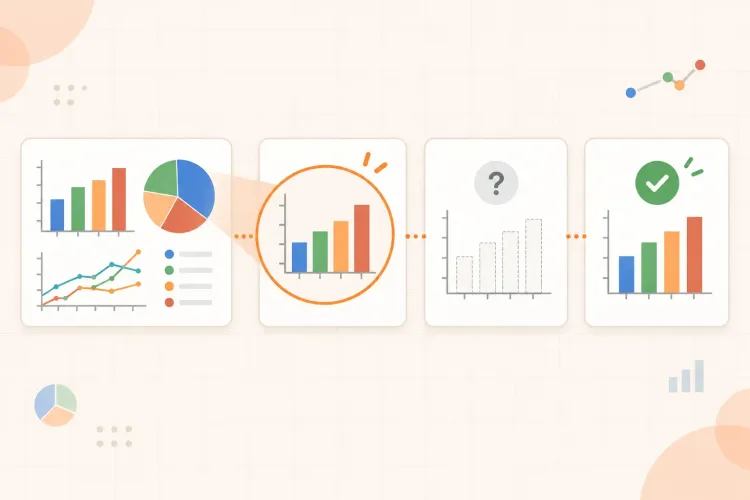
Diagrams, charts, and graphs can make a topic look familiar without proving that you understand it. You may recognise the shape of a graph, remember where a label sits, or follow a diagram while the page is open, then struggle to explain it when the exam shows a different version.
A more useful way to study a visual is to treat it as an argument or process, not as a picture to copy. First identify what the visual is showing and how it is organised. Then describe the relationships in words, hide the labels or source, and answer questions that force you to retrieve the meaning. Finally, check your explanation against the original and repair the exact gap you found.
How to study diagrams, charts, and graphs
Use this sequence whenever a visual appears in your notes, textbook, lecture slides, or a past paper:
- Read the frame. Check the title, caption, axes, units, legend, labels, and surrounding explanation.
- Name the structure. Decide whether the visual shows a sequence, comparison, distribution, cycle, hierarchy, mechanism, or change over time.
- Describe the relationships. Explain what is connected, increasing, decreasing, grouped, separated, or dependent on something else.
- Hide the support. Cover labels, close the source, or redraw a simplified version from memory.
- Answer targeted questions. Ask what the visual shows, why a relationship matters, and what would change under a new condition.
- Check and repair. Compare your answer with the source and record the missing label, relationship, condition, or interpretation.
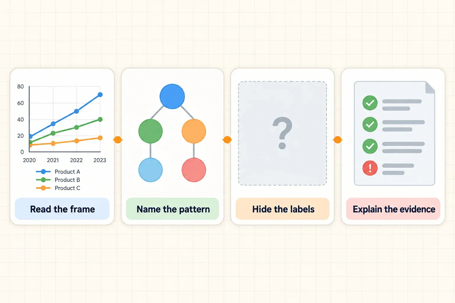
This process keeps the visual connected to understanding and recall. Copying it neatly may be useful when you are first orienting yourself, but it is not enough on its own. You need to produce an explanation that would still make sense if the colours, labels, order, or values changed.
Read the visual before trying to memorise it
Begin with the features that define how the visual should be read. The same line or shape can mean different things depending on the units, scale, legend, and surrounding question. A graph without its axes is not yet an interpretation. A biological process without arrows and conditions is not yet a mechanism.
Use a short frame check:
- Title or caption: What is the visual about, and what question might it answer?
- Axes and units: What is being measured, and in what units?
- Scale: Are the intervals equal? Does the axis begin at zero, or is part of the range omitted?
- Legend and labels: What do the colours, symbols, lines, and sections represent?
- Direction: What does an arrow, time axis, ranking, or sequence imply?
- Context: What explanation, experiment, or paragraph does the visual belong to?
For example, a line graph showing reaction rate against temperature should not be reduced to “the orange line rises and falls.” You need to know which variable is controlled, which is measured, where the optimum appears, and whether the graph supports a conclusion about the process. A chart’s labels and context determine what claims the data can support.
University study guides make the same basic point: read the title, labels, scale, and context before drawing conclusions. Northern Illinois University’s guide to understanding diagrams and graphs is useful when you want a fuller checklist for interpreting visual information.
Name the kind of structure you are looking at
Once the frame is clear, give the visual a structural description. This prevents you from memorising isolated positions and helps you predict the questions it can answer.
Common structures include:
- Sequence: stages in a process, such as protein synthesis or a historical timeline.
- Cycle: a process that returns to its starting point, such as the carbon cycle.
- Comparison: categories or groups placed side by side to reveal differences.
- Trend: values changing across time, conditions, or another continuous variable.
- Distribution: how observations are spread, clustered, or skewed.
- Relationship map: connected concepts, causes, effects, or parts of a system.
- Hierarchy: levels arranged from broad to specific or from input to output.
The structure tells you what to look for. In a sequence, ask what changes between stages and why the order matters. In a trend, ask where the direction changes and what evidence supports that change. In a relationship map, ask what would be affected if one component were removed.
Do not let the category replace the explanation. Saying “this is a cycle” is only a starting point. Your next sentence should state what moves through the cycle, what each stage does, and which conditions alter the route.
Match your questions to the visual type
Different visual formats hide different kinds of information. Use the format to decide what to retrieve instead of applying the same label exercise to every image.
| Visual type | First question to ask | Stronger follow-up |
|---|---|---|
| Line graph | What changes across the horizontal axis? | Where does the trend change, and what might explain that change? |
| Bar chart | Which categories differ, and by how much? | What comparison is supported, and which category is the clearest exception? |
| Pie chart | What share does each segment represent? | What does the largest or smallest share imply in this context? |
| Flow diagram | What happens first, next, and last? | What would change if one step or connection were removed? |
| Scatter plot | How are the two variables distributed? | Is the pattern strong enough to support a conclusion, and what else might affect it? |
For a line graph, retrieve the variables, units, direction, turning points, and unusual values. For a bar chart, compare categories using the scale rather than relying on the visual height alone. For a pie chart, connect each proportion to the whole. For a flow diagram, reconstruct the order and purpose of each step. For a scatter plot, describe the association without turning it into a causal claim automatically.
You do not need to memorise the format names as a separate list. The point is to let the visual’s structure generate better questions. When you can identify both what the format shows and what it leaves out, your explanation becomes more precise.
Turn visual features into questions
A visual becomes useful study material when each important feature can be tested. Write questions that require more than naming what you can already see.
Start with four levels:
| Question level | Example prompt | What it tests |
|---|---|---|
| Locate | What does this label or axis represent? | Vocabulary and orientation |
| Describe | What pattern or sequence does the visual show? | Accurate observation |
| Explain | Why does this relationship or change occur? | Mechanism and reasoning |
| Apply | What would you expect if this condition changed? | Transfer to a new situation |
Suppose a diagram shows an enzyme-substrate interaction. A locating question might ask what the active site is. A description question might ask what changes when the substrate binds. An explanation question might ask why the shape matters. An application question might ask what you expect if temperature changes the enzyme’s structure. The four prompts use the same visual but demand increasingly flexible understanding.
For a chart, include questions about comparisons and evidence:
- Which category is highest or lowest, and by how much?
- What trend is visible across the measured range?
- Where does the pattern change direction?
- Which claim is supported by the data, and which claim goes beyond it?
- What additional measurement would help distinguish two explanations?
For a diagram, ask about function and consequences:
- What is the role of this part?
- Which step comes next, and why?
- What connects these two components?
- What would stop or change if this part were missing?
- Which label could be removed while the overall process still works?
Questions should expose the visual’s logic. If every prompt only asks you to name labels, you may know the vocabulary while missing the relationship between the parts.
Explain the visual without looking
Close the source and describe the visual aloud or on paper. Begin with a one-sentence overview, then move through the evidence in a deliberate order. You can use this frame:
- What it represents: identify the topic and purpose.
- How it is organised: name the sequence, comparison, trend, or relationship.
- What the main pattern is: state the most important change or connection.
- What supports the claim: refer to a label, value, stage, or visual feature.
- What the limit is: mention a condition, exception, missing variable, or conclusion the visual cannot establish.
For example: “This graph compares oxygen consumption at different exercise intensities. Oxygen consumption rises as intensity increases, then levels off near the top of the measured range. The plateau is visible in the final points, but the graph alone does not show whether the cause is a physiological limit or a measurement limit.”
That last sentence matters. Studying a graph is not only finding a pattern. It is also learning what the evidence does and does not justify. If you are unsure how to read a particular chart or diagram, return to the title, variables, units, and context before guessing at the explanation.
Redraw only what you need
Redrawing can help when it makes the structure visible, but a detailed copy can become another form of passive review. Use a reduced version with the minimum information needed to reconstruct the idea.
Try one of these redraws:
- a blank axis with the labels removed
- a sequence of empty boxes for the stages of a process
- a skeleton diagram with only the main components
- a table that contrasts categories or conditions
- a relationship map with the connecting arrows left blank.
Then rebuild the missing information from memory. Add labels, arrows, values, or short explanations only after you have tried. If you cannot reproduce the entire visual, reproduce its logic: what enters, what changes, what leaves, and what controls the outcome.
A useful redraw should make checking easy. If your version is so elaborate that you spend more time decorating it than testing it, simplify it again.
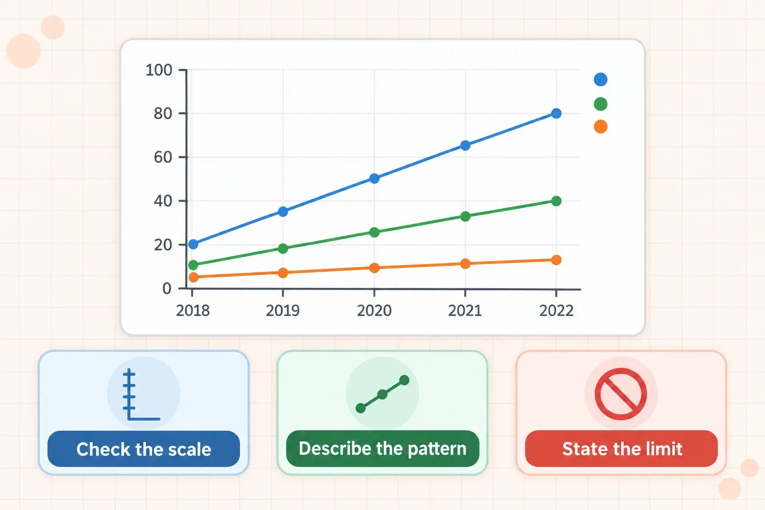
!How to read a graph actively: check the scale, describe the pattern, and state the limit of the evidence.\n\n## Study graphs without confusing correlation and explanation
Graphs often tempt students to turn a visible pattern into a causal claim. A line that rises with another line shows association in the displayed data, but it does not automatically prove that one variable caused the other.
When studying a graph, separate three statements:
- Observation: what the plotted values visibly do.
- Interpretation: what relationship the pattern may suggest.
- Conclusion: what the evidence supports after considering the context and design.
For example, if study time and test scores rise together, the observation is that the variables are positively associated in the sample. An interpretation might be that additional study is related to better performance. A causal conclusion would require more information about other factors and how the data were collected.
This distinction is useful in science, economics, psychology, and social research. It also improves exam answers because it stops you from claiming more than the graph can support. University of Waterloo’s guide to reading graphs and diagrams offers a useful reminder to consider the background information alongside the visual when you practise this kind of interpretation.
Use an AI tool without outsourcing the thinking
An AI study tool can help you turn a diagram, chart, or screenshot into possible questions, but the questions are only useful if they remain tied to the original visual. Ask for prompts that refer to the axes, labels, stages, variables, relationships, and limitations. Then answer with the source hidden and check every detail against the original.
One useful request would be: “From this diagram, create six questions: two label questions, two relationship questions, one ‘what changes if...’ question, and one question about what the visual cannot prove. Do not show the answers until I respond.”
Do not accept a polished explanation automatically. An AI-created question can misread a label, invent a relationship, or ignore an important condition. The original chart or diagram is the authority, and your answer should be checked against it.
If you want to keep the visual source, questions, answers, and review in one study workflow, you can build a study session from your material. For a PDF containing several figures, you can also create practice questions from a PDF, then verify the questions against the relevant figure instead of treating the generated set as a substitute for reading it.
Common mistakes when studying visuals
Memorising colours and positions
Colours and positions are useful cues, but they can disappear in a black-and-white printout or change in a new version of the visual. Learn what each colour represents and what relationship the position communicates.
Copying before interpreting
A neat reproduction can hide the fact that you do not know what the arrows, scale, or labels mean. Read the frame and state the visual’s purpose before redrawing it.
Asking only label questions
Definitions matter, but exams also ask you to compare, explain, predict, and evaluate. Mix label prompts with relationship and application questions.
Ignoring units and scale
A trend can look dramatic or insignificant depending on the scale. Check the intervals and units before describing the size of a change.
Treating every visible pattern as proof
A graph may show association without establishing cause. Separate what you observe from what you infer and what the evidence can support.
Studying the visual with the answer visible
Recognition is not the same as recall. Cover a label, use a blank version, or close the source before explaining it.
A short visual-study routine
Choose one visual and run this routine:
- Spend two minutes reading its title, context, axes, units, legend, and labels.
- Write one sentence naming its main structure and purpose.
- Create four questions: one locating, one descriptive, one explanatory, and one applied.
- Close the source and answer the questions without copying the visual.
- Reopen it and mark the first missing relationship, condition, or label.
- Redraw only that weak part and answer a changed question about it later.
The routine is short enough to use after a lecture or while reviewing a textbook chapter, but it is not a race. If the visual is complex, split it into one meaningful region or stage at a time. Once each part is clear, explain how the parts fit together.
How to know you really understand a visual
You probably understand a diagram, chart, or graph when you can do more than recognise it. Check whether you can:
- explain its purpose without repeating the caption word for word
- identify the variables, units, labels, and scale
- describe the main relationship or sequence in plain language
- answer a question with the visual hidden
- explain what would change under a new condition
- distinguish observation from interpretation
- identify one limit or ambiguity in the evidence
- connect the visual to the surrounding concept or process.
If one of these fails, do not restart the entire chapter. Mark the exact gap and create one new question that targets it. That gives your next review a clear purpose.
The goal is not to remember the picture as a fixed arrangement. Read the frame, identify the structure, explain the relationships, hide the support, and test what changes when the conditions change. When you can reconstruct the visual’s meaning rather than its appearance, diagrams, charts, and graphs become usable evidence instead of decoration in your notes.