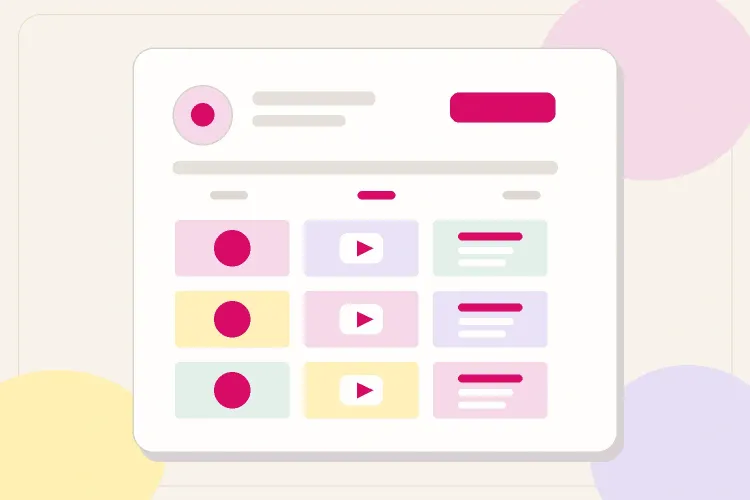


A cohesive Instagram feed should make a visitor understand your world quickly: what you make, who it is for, and what kind of content they can expect. It does not require every post to use the same filter, colour, or layout.
The practical goal is a repeatable system. Choose a small set of visual decisions, give each post a role, then review the grid before it goes live. That keeps the feed recognisable without turning content creation into a design project.
Start with a visual direction, not a mood board
Describe the feed with three useful words. A food creator might choose “bright, generous, everyday.” A fitness creator might choose “clean, energetic, direct.” A creator who teaches editing might choose “calm, precise, useful.”
Those words become a filter. Before posting, ask whether the image, cover, caption, and format support that direction. They do not need to match perfectly. They need to feel like they came from the same creator.
Build a small visual system
Choose a palette, one editing direction, and two or three recurring visual cues. The cues can be framing, background, typography on educational slides, a recurring cover treatment, or how people appear in the frame.
Avoid trying to control every colour in real life. It is more sustainable to repeat a few choices: similar warmth, consistent contrast, a limited set of cover colours, and a familiar crop. That gives the grid rhythm while leaving room for real moments and different locations.
Give posts different jobs
A cohesive feed can mix Reels, carousels, photos, client work, and personal posts. The consistency comes from the system, not from publishing only one format.
| Post role | What it can do | Visual cue to repeat |
|---|---|---|
| Discovery | Reach new people with a Reel or useful carousel | A clear cover and recognisable opening frame |
| Trust | Show process, proof, or personality | Similar lighting, crop, or background |
| Depth | Teach a method or explain a point | A repeatable slide layout or typography |
| Offer | Point to a service, product, or collaboration | A calm, direct cover that fits the feed |
This makes planning easier. Instead of asking “what fits my aesthetic?”, decide what job the next post needs to do, then use the visual system you already chose.
Plan the grid before you publish
Look at the latest nine to twelve posts together. Check whether one colour is dominating, whether two similar covers sit together, and whether there is enough change in format and subject.
If you want to rearrange ordinary upcoming posts before scheduling them, Publer’s visual feed planner lets you upload media, change the order, and preview an Instagram, Reels, or TikTok feed without creating an account. Use it to test the sequence, not to force every post into a rigid pattern.
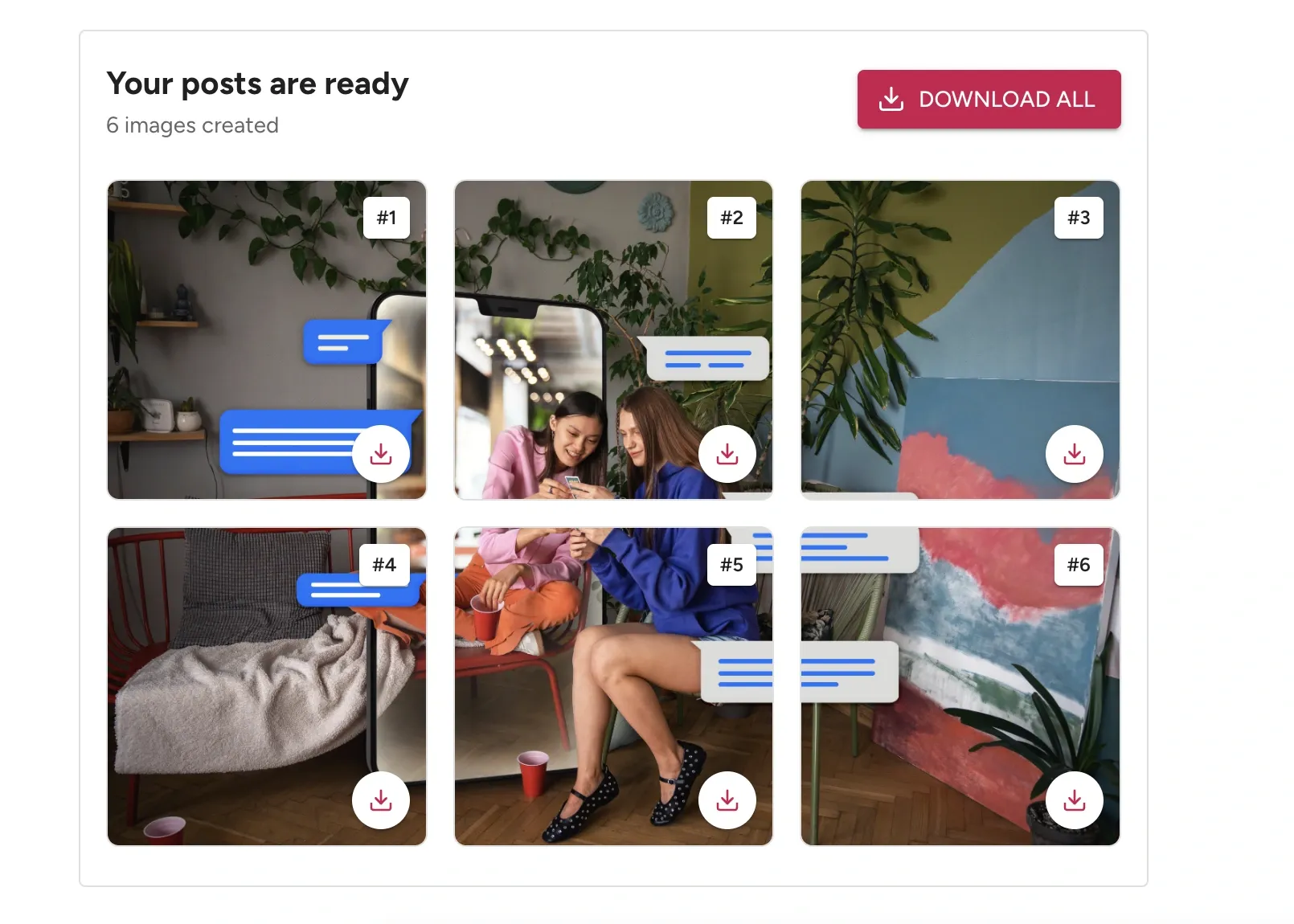
Use the Instagram grid maker only when a connected multi-post visual genuinely adds to the idea. Choose three columns, then choose Grid posts for separate square tiles or Carousel slides for one full-height swipeable post. Review the generated tiles before downloading them. A puzzle grid should never be the system holding the whole feed together.
Use a pre-publish check that takes two minutes
For an ordinary post, open the Instagram post preview, upload the image, choose Feed Post, Story, or Reel, and add the caption. Checking the rendered post makes it easier to catch an awkward crop, weak cover, or caption that does not match the visual before it is live.
Before posting, ask:
- Does the first frame or cover make sense at small size?
- Does this post add a useful role to the recent grid: discovery, trust, depth, or offer?
- Does it repeat at least one visual cue without copying the last post?
- Would the content still be worth publishing if the grid did not exist?
The final question matters. A cohesive feed should make useful content easier to recognise, not turn the feed into the product.

Make different formats feel like they belong together
Photos, Reels, and carousels do not need the same composition. They need one or two shared signals. A fashion creator may use the same warm edit in photos, a familiar cover colour for Reels, and a simple type treatment for carousels. A creator who shares client projects may keep the project images natural, then use a consistent first slide to explain the result.
Treat the first frame as the bridge between formats. It is the only part of a Reel or carousel that regularly sits in the grid at a small size. A clear crop, repeated cover style, and readable contrast do more for cohesion than forcing every video frame to match a photo.
Plan the next nine posts, not the next nine months
Planning a full quarter makes a feed feel rigid. Planning the next nine posts gives enough context to spot repetition without locking the creator into an old idea.
Try a simple rhythm:
- One discovery post: a useful Reel, clear hook, or shareable carousel.
- One trust post: a process, personal perspective, proof, or behind-the-scenes moment.
- One depth post: a tutorial, framework, case study, or opinion with substance.
Then repeat the rhythm with a different subject or visual emphasis. If two cover-heavy posts land beside each other, move one. If the grid is becoming all faces, add a detail, an object, a workspace, or a result. The aim is balance, not a perfect pattern.
Keep editing consistent without making content dull
Save a small editing recipe: exposure range, warmth, contrast, saturation, and any crop preference. This is more useful than relying on a named filter because it works across phone photos, client images, screenshots, and video covers.
When a post needs to break the palette, let it break one rule deliberately. A dark event photo can still fit a light feed if the next cover brings the palette back. A campaign image in a brand’s colours can still fit if the surrounding post uses the creator’s familiar framing or typography. Consistency is the return point, not a restriction on every asset.
Use performance to improve the system
Do not keep a visual system only because it looks polished. Review what it helps people do. A Reel cover may earn profile visits, a carousel may earn saves, and a personal photo may earn thoughtful comments. Those are different jobs.
Every month, note the posts that brought saves, shares, profile visits, follows, replies, or qualified enquiries. Look for the combination of topic, format, and visual treatment that earned the response. Keep the parts that make content easier to understand and remove the parts that only make production slower.
Let the system evolve
Review the last thirty posts every few months. Keep the visual decisions that make content easier to produce and the formats that earn saves, replies, profile visits, or qualified enquiries. Change one element at a time when the feed starts feeling stale.
Final takeaway
The most cohesive Instagram feeds are not the most controlled. They are the ones with a clear point of view, repeatable visual cues, and enough variety for the audience to keep discovering something new.